Estimated reading time: 1 minute, 58 seconds
This year the US elections were special for so many reasons, but in a personal level, as the mom of a 9 year old who ends up watching news with adults, it also became an opportune moment to talk about democracy and politics.
Growing up, she knew, pretty quickly that Trump = bad (sorry, no grey about this one) and that US police kill black people (not my fault, that that’s the news about them, but I explain of course that police are NOT supposed to be doing that, they should protect everyone).
This morning, before school, I had the rerun of Kamal Harris and Joe Biden’s speech on TV for her to watch and she never tried to switch the channel. She was fascinated. I am so happy she is old enough to watch this moment in history. To hear Kamal speak directly to young girls. It was inspiring and my kid watched my cry tears of joy.
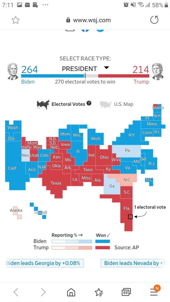
One of the most fruitful discussions my daughter and I had was about election maps. She kept seeing loads of red and very little blue and asking me, “but how are you saying Biden might win?”. I explained to her that lots of those swaths of land were rural and had low population density, whereas big cities and both coasts had higher population density. I also explained the different electoral votes for different states as being relative to population roughly.
Anyway, while mentioning this on Twitter, I got two really useful ALTERNATIVE visualizations, which I think I will share wit my students when we discuss these kinds of things in class soon inshallah.
The one I like most is by Karim Douïeb, a GIF that shows the blue/red voting using bubbles representing POPULATION not land. It is a work of art and science and if you have not seen it you will love it.
I am not the first one and I surely won't be the last one to point out that traditional electoral maps are a misleading way to represent the outcome of an election. This is something you can't stress enough: https://t.co/euqDAvTvmU pic.twitter.com/KCEGigmaZu
— Karim Douïeb (@karim_douieb) February 22, 2020
The second is by WSJ (thanks Dave Stachowiak) which resizes states by population:

So yeah. At age 9, my daughter and I have discussed politics, democracy and data visualization already! Children ask critical questions that help us articulate some tacit knowledge we have, but in hindsight, not all adults have it, so I think it’s important to go back to my students and discuss these things.
Tell me about conversations you’ve been having with your own kids!

Another map for your discussions: simple and clear (from Le Monde) lemonde.fr/international/…
Very cool and clear! Thanks Pauline
Um… So we let my 3 to watch a little bit of Star Wars before bed. Then he woke up w a tummy ache, so we let him watch Biden/Harris speak. He said:
“This isn’t the Star Wars movie anymore. Now we’re watching the president movie!”
😂 oh God it feels that way sometimes!
I’ve been checking out how Fox News reports on the election over the last week, just to get a feel for their spin. They posted about one of the election maps you mentioned: https://www.https//nypost.com/2020/11/07/this-map-shows-what-the-us-presidential-vote-really-looks-like/